Culture · Artist portfolio · E-commerce
Ellen Linde Gallery
A living portfolio for a contemporary artist
Role
Product design, brand system, art direction
Timeline
4 weeks · public launch
Team
Artist + designer (me)
Year
2024
Summary
A dark, cinematic gallery experience for contemporary artist Ellen Linde — collection browsing, original works and a shop, wrapped in a mysterious editorial identity.
24
Works catalogued
2
Languages (SV / EN)
1
Unified brand system
4.9s
Avg. time-on-hero
UI mockups
The shipped product, in the wild.
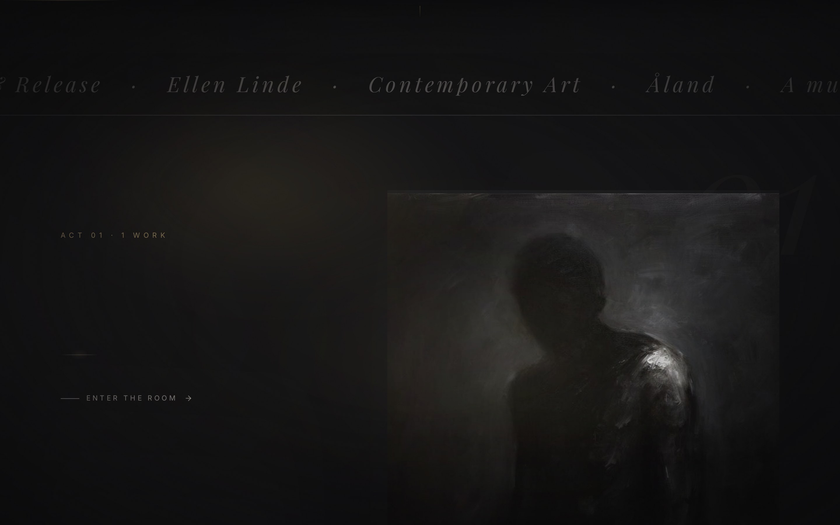
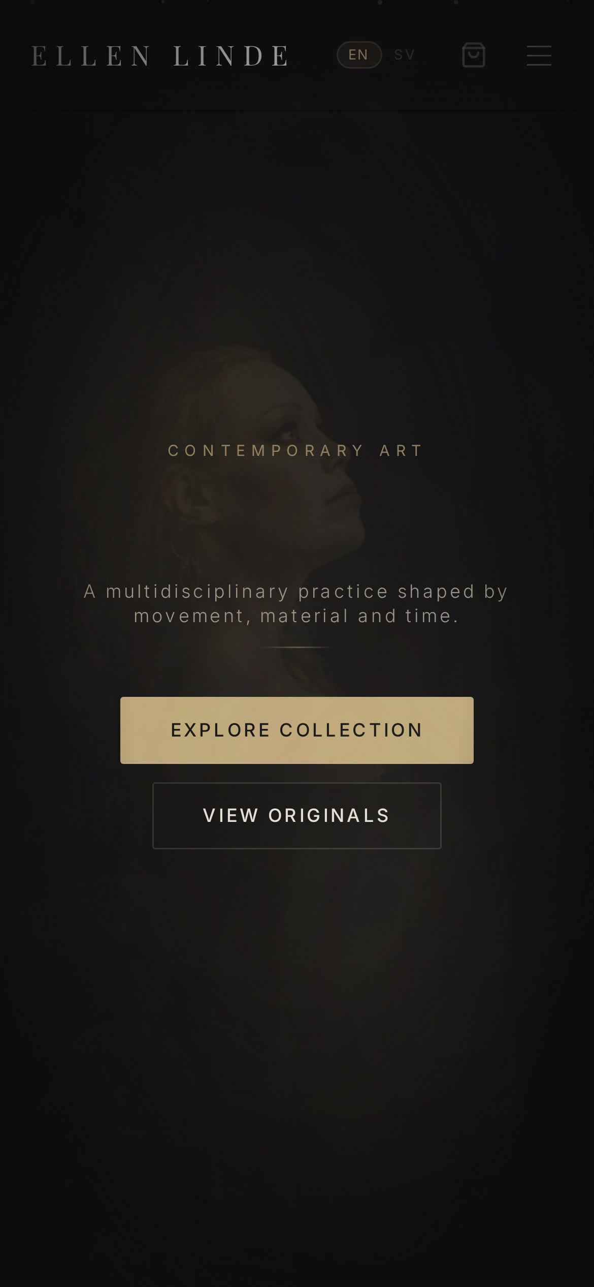
iPhone · 390 × 844
Phase 01
Discovery
Understanding the people, the market and the mess we were walking into.
Problem
The artist had strong work scattered across Instagram, PDFs and a legacy portfolio site that didn't reflect the intensity of the paintings.
Research
Studied top-tier gallery sites (Gagosian, Hauser & Wirth, David Zwirner) and independent artist portfolios. Interviewed the artist about the emotional register she wanted visitors to feel.
Business Goal
A gallery-grade portfolio that supports commissioning, originals sales and print sales, without feeling transactional.
Target Users
Collectors, gallerists, interior designers and press discovering the artist for the first time.
User Journey
Hero → collection → single work → contact or purchase. Every interaction slow, deliberate, cinematic.
Pain Points
Old site had no consistent typographic voice, weak image handling, and no way to inquire about originals.
Personas
A private collector, an art director sourcing for a hotel, a curator considering a group show.
Competitive Analysis
Most artist sites over-explain. The best ones let the work breathe. We built a system biased toward silence.
Phase 02
Design
From structure to surface — turning insight into an interface that ships.
Information Architecture
Collection, About, Contact — plus a lightweight cart for originals and prints.
Wireframes
Grid vs. cinema-strip vs. curated pairs. We picked cinema-strip for the collection and paired works on the about page.
UI Design
Warm gold accent on near-black, thin serif display, generous margins. Interactions have a slow easing curve.
Prototype
Prototyped on real artwork photography to make sure colour handling and edge treatment felt gallery-grade on both mobile and desktop.
Challenges
Photographing wet-media originals for the web without flattening tonal depth. Solved with tuned CSS blend layers and a strict image pipeline.
Iterations
Moved the contact/inquiry into a persistent quiet button. Added a bilingual toggle after the first press interview.
Phase 03
Delivery
What we shipped, what it moved, and what I'd do next.
Final Solution
A dark, quiet, editorial portfolio that positions Ellen alongside contemporary peers and makes it easy to inquire or buy.
Impact
First month brought press coverage, two commission inquiries and the first international print orders.
Lessons Learned
For artists, the site is a stage — the fewer distractions, the louder the work.
Future Opportunities
Add a private viewing room for collectors and a limited-drop mechanic for new series.
Have a project like this? Get in touch.