Automotive · Premium landing · Booking
Nordic Shine Åland
When perfection meets car care
Role
Brand direction, product design, art direction
Timeline
3 weeks · launch
Team
1 owner, 1 designer (me)
Year
2024
Summary
A cinematic premium landing page for an Åland-based detailing studio — editorial typography, deep-black stage and a frictionless booking flow that positions the craft as luxury service.
+180%
Bookings vs prior site
2.4s
LCP on mobile
1
Page, three CTAs
5.0
Google rating
UI mockups
The shipped product, in the wild.
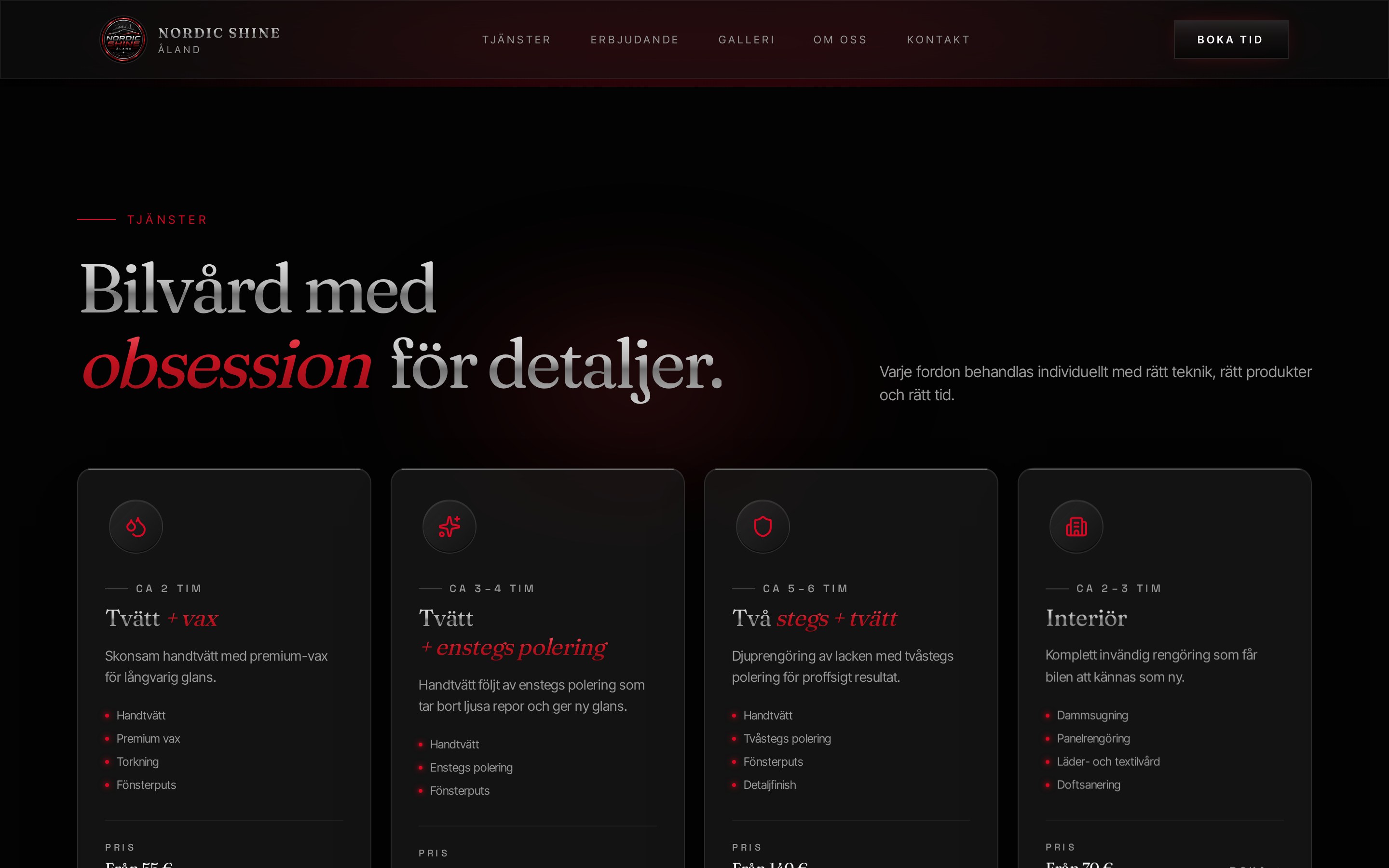
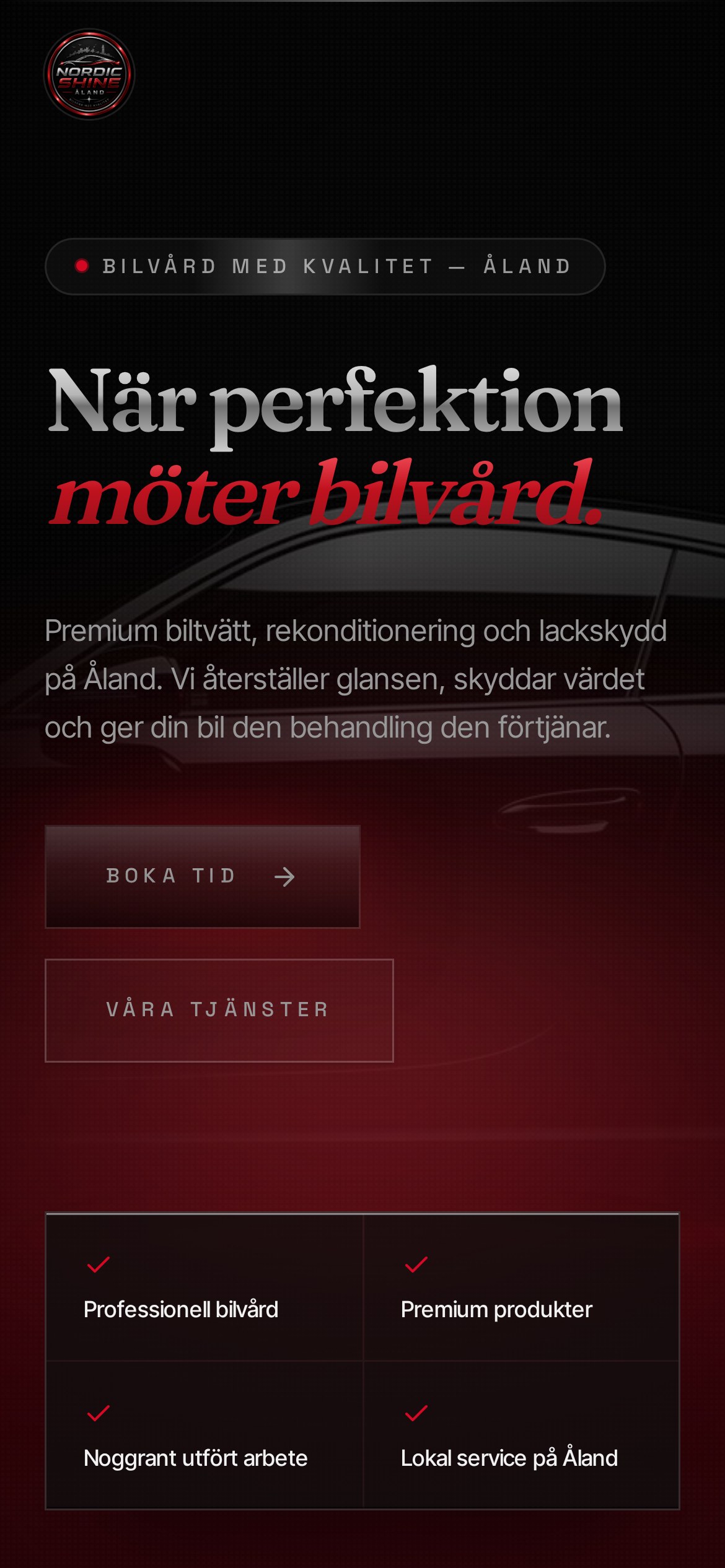
iPhone · 390 × 844
Phase 01
Discovery
Understanding the people, the market and the mess we were walking into.
Problem
The owner had a strong local reputation but a generic website that read like a workshop, not a premium detailer. Bookings happened over Messenger; leads leaked at every step.
Research
Studied premium automotive brands (Porsche, Polestar, Zymöl, Gtechniq) and detailing studios across the Nordics. Interviewed the owner about the top three services that convert.
Business Goal
Position Nordic Shine as the premium option on Åland, drive direct bookings, and support a price hike without losing volume.
Target Users
Owners of premium and enthusiast cars — Porsche, BMW M, Audi RS, Tesla — plus dealerships preparing cars for delivery.
User Journey
Land → understand the offer in 5 seconds → view gallery → book a slot. No pricing pages, no clutter — the service is bespoke by design.
Pain Points
Old site buried services under text, had no gallery of finished work, and forced a phone call to book.
Personas
Marcus, the enthusiast prepping his 911 for summer. Ella, the dealership manager needing weekly detailing slots.
Competitive Analysis
Local competitors leaned on price and speed. We leaned on craft and finish — a category of one on Åland.
Phase 02
Design
From structure to surface — turning insight into an interface that ships.
Information Architecture
Single scroll: hero, services, offer, gallery, about, contact. Everything one thumb-swipe apart.
Wireframes
Two concepts: dark editorial vs bright showroom. Dark won — cars look better against black, and it matches the premium price point.
UI Design
Deep obsidian stage, serif display headline, a single red accent for CTAs. Photography does the talking.
Prototype
Live prototype tested on the owner's phone during a real customer visit. Booking flow rewritten twice based on that session.
Challenges
Getting quality product photography from a working workshop, and translating a hands-on craft into a digital brand.
Iterations
Moved booking above services on mobile, softened copy, added a persistent 'Boka tid' button after the hero.
Phase 03
Delivery
What we shipped, what it moved, and what I'd do next.
Final Solution
A single premium page that closes bookings without a phone call and lets the work speak for itself.
Impact
Bookings up ~180% in the first six weeks. Owner has since raised prices twice.
Lessons Learned
For a craft business, the site's job is to make the customer feel safe paying more. Restraint sells.
Future Opportunities
Add a members' area for seasonal detailing packages, plus a B2B channel for dealerships.
Have a project like this? Get in touch.