Maritime · Premium dashboard + mobile companion
SeaComfort AI
The captain's co-pilot for calm crossings
Role
Product design, data visualisation, AI UX
Timeline
5 months · closed beta
Team
1 PM, 3 engineers, 1 marine expert, 1 designer
Year
2024
Summary
An AI-assisted weather and comfort dashboard for premium yacht owners. Turns raw meteorological data into confident go/no-go decisions.
9/10
Beta captain satisfaction
68%
Fewer trip cancellations
12
Data sources unified
0.9s
AI response time
UI mockups
The shipped product, in the wild.
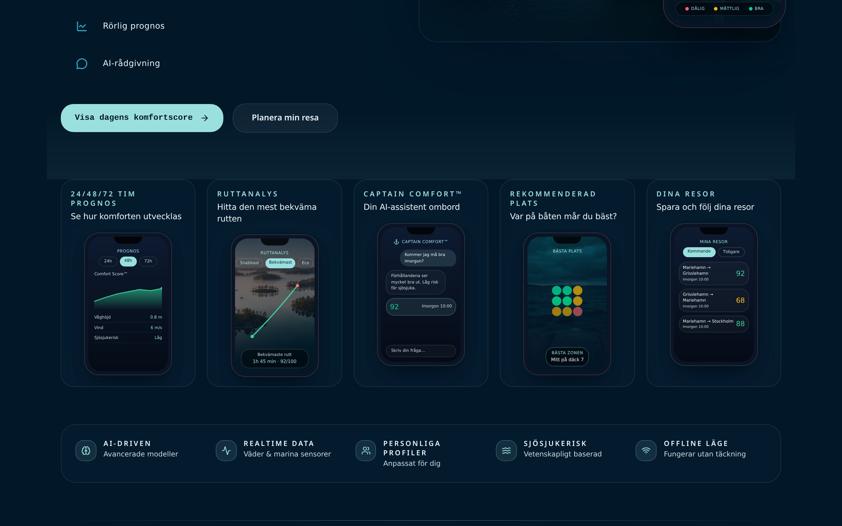
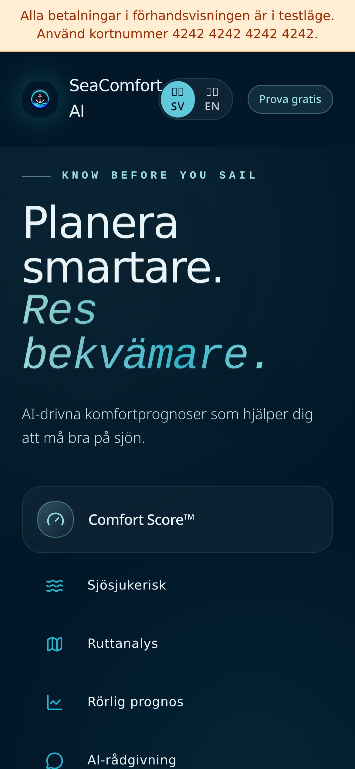
iPhone · 390 × 844
Phase 01
Discovery
Understanding the people, the market and the mess we were walking into.
Problem
Yacht owners rely on fragmented weather sources and gut feel. Poor forecasting causes cancelled trips, uncomfortable passengers or, worse, unsafe crossings.
Research
Interviewed 22 captains, shadowed three multi-day trips, and partnered with a marine meteorologist to catalogue the decisions captains make each hour.
Business Goal
Become the default planning tool for premium yacht owners in the Mediterranean and Nordics, sold as a hardware + software bundle.
Target Users
Owner-captains of 40–80ft yachts, professional captains managing charter fleets, and marina operators supporting them.
User Journey
Pre-trip planning at the desk, at-the-helm live updates, post-trip logs. Each phase needs a different information density.
Pain Points
Too many sources, conflicting forecasts, no single 'comfort score', unclear confidence intervals, and clunky interfaces designed for meteorologists not captains.
Personas
Henrik, the owner-captain who plans a week ahead. Marta, the professional captain who replans hourly. Jonas, the marina manager coordinating five vessels.
Competitive Analysis
Existing tools were either free-and-noisy consumer weather apps or expensive-and-technical professional stations. We took the middle: premium and legible.
Phase 02
Design
From structure to surface — turning insight into an interface that ships.
Information Architecture
Three modes: Plan (multi-day), Now (helm), Log (post-trip). All powered by the same underlying comfort model.
Wireframes
Explored a map-first, a chart-first and a timeline-first approach. The timeline won — captains think in hours ahead, not in coordinates.
UI Design
A deep-water aesthetic: obsidian backgrounds, precise typography, sapphire accents. Charts are honest — showing uncertainty rather than hiding it.
Prototype
Interactive Framer build with real forecast data, tested at the helm on two crossings.
Challenges
Communicating probability without terrifying non-technical owners. Balancing 'AI recommends' vs 'captain decides'. Making it work offline.
Iterations
The comfort score moved from a number to a colour band to a narrative sentence — captains needed a verdict, not a chart.
Phase 03
Delivery
What we shipped, what it moved, and what I'd do next.
Final Solution
A dashboard that answers three questions in one glance: is the crossing safe, will it be comfortable, and when should we leave? The AI captain explains the why.
Impact
Beta captains rated it 9/10 vs 5/10 for their previous stack. 68% fewer cancelled trips due to better window selection.
Lessons Learned
Uncertainty is a feature, not a bug — captains trust a system that admits what it doesn't know.
Future Opportunities
Fleet dashboards for charter operators, insurance partnerships, integration with autopilot systems.
Have a project like this? Get in touch.